--
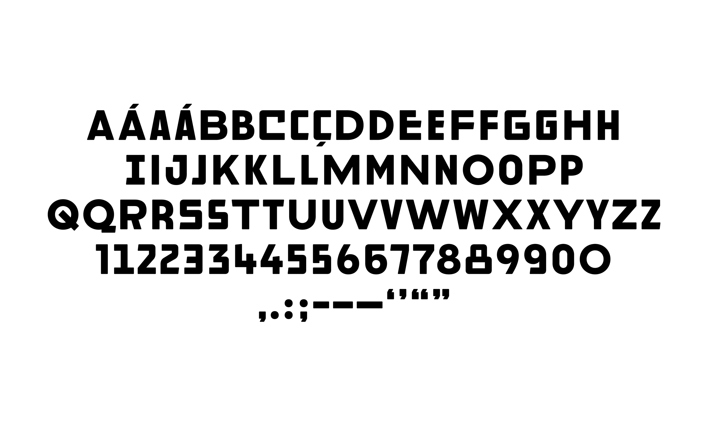
1. Chill Gill
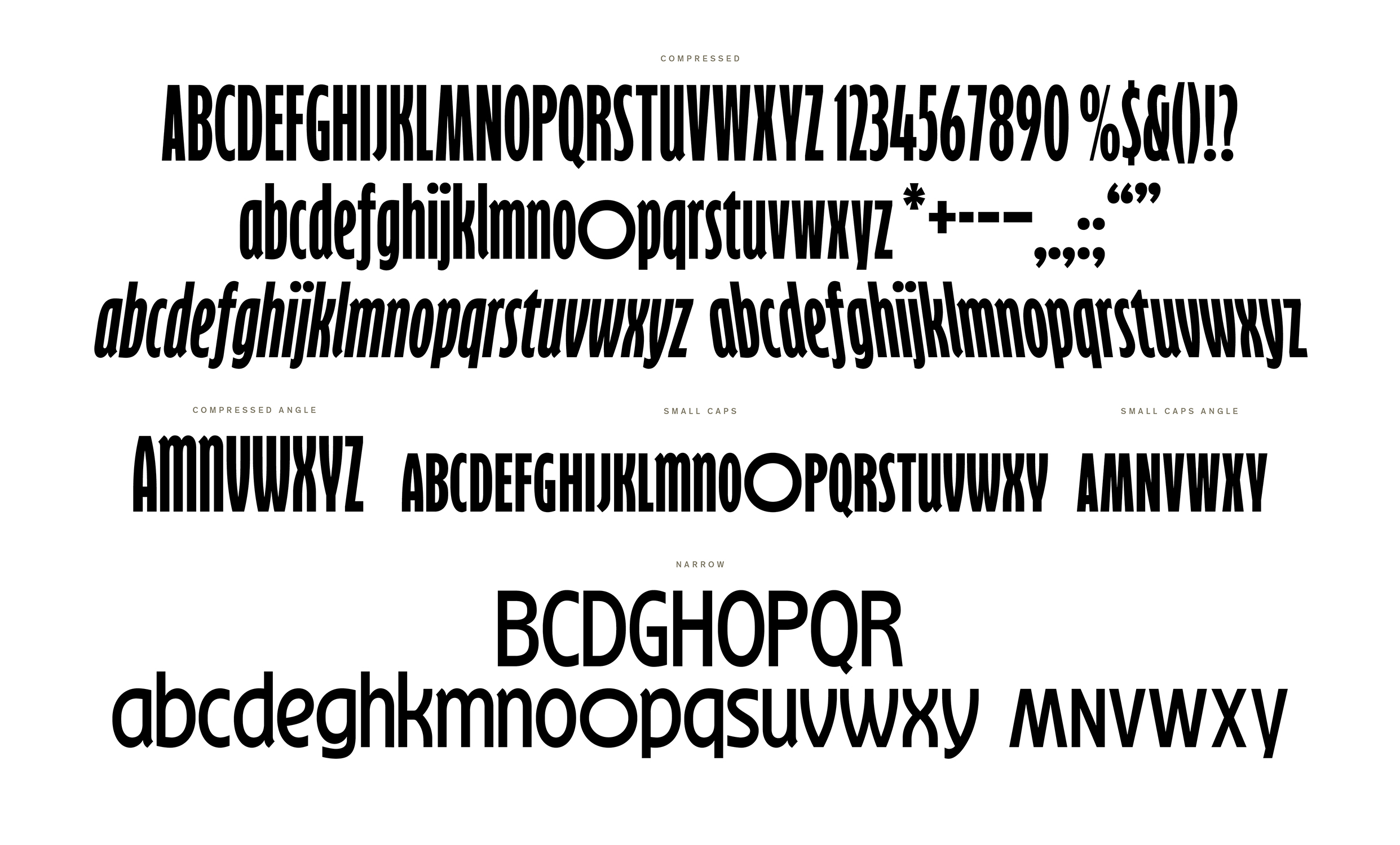
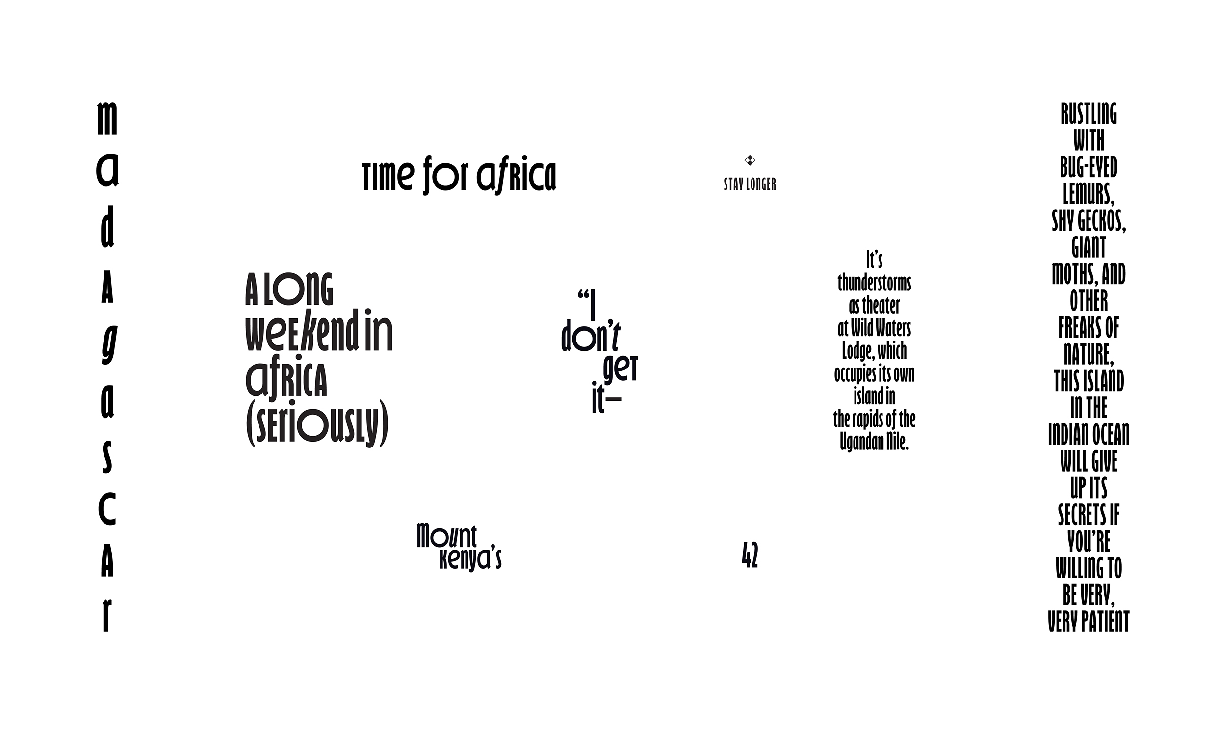
When we set out to redesign Condé Nast Traveler in the middle of 2016, I was looking for a bold, condensed display typeface to compliment the more delicate, yet nuanced personality that Canela (our newly chosen serif display typeface) brought to the table. Canela had recently been released by Commercial Type and we found our exploration of it to carry a proper tone for the magazine. Throughout my research, I came across an original drawing of Gill Sans Bold Extra Condensed, from 1937. I immediately fell in love with it’s quirks and personality and thought it would be the perfect fit, especially with it’s vintage feel and the fact that I’d rarely seen the font in use, particularly in other magazines. There had only been one digitization made which allowed us to quickly implement it in the process, but I knew that I eventually wanted to have it redrawn with a more much more developed and flexibile range of characters. As we began to plan our Africa-themed special issue to be published in April of 2017, we had seven issues since the redesign under our belt and it felt like the right time to tap trusted collaborator, Tal to finally get this thing redrawn, but also have some fun creating special characters for this particular issue. In his own words: “That typeface is, ahem, a bit nuts but Caleb wanted it to be even nuttier. I drew a new typeface loosely inspired by the original metal version of Gill Sans, but with amplified drawing oddities, redundant inconsistencies, a huge range of alternates and a lot of flat out bizarre details.
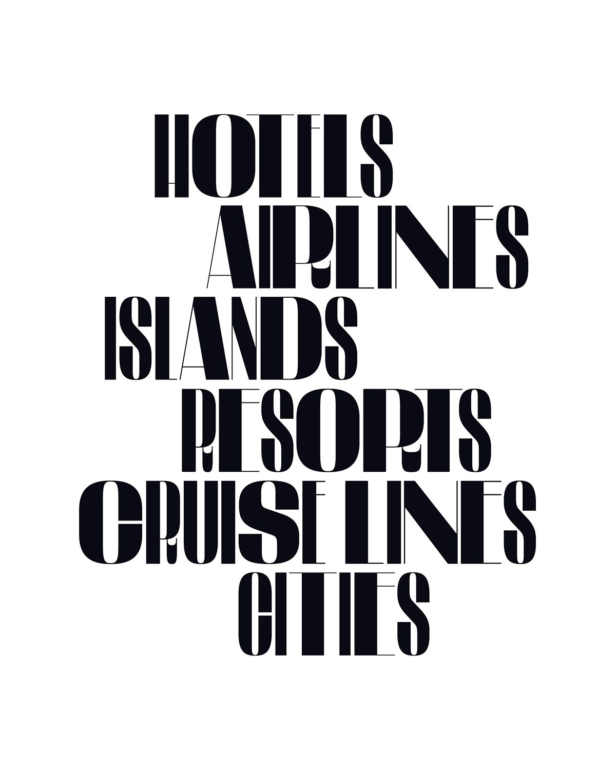
Below are some of the fruits of that commission. The typeface ultimately replaced the original in our arsenal and became a defining typographical feature of the magazine. You can also see examples in use here, here, and here. A digital license was ultimately utilized for the redesign of cntraveler.com.


--
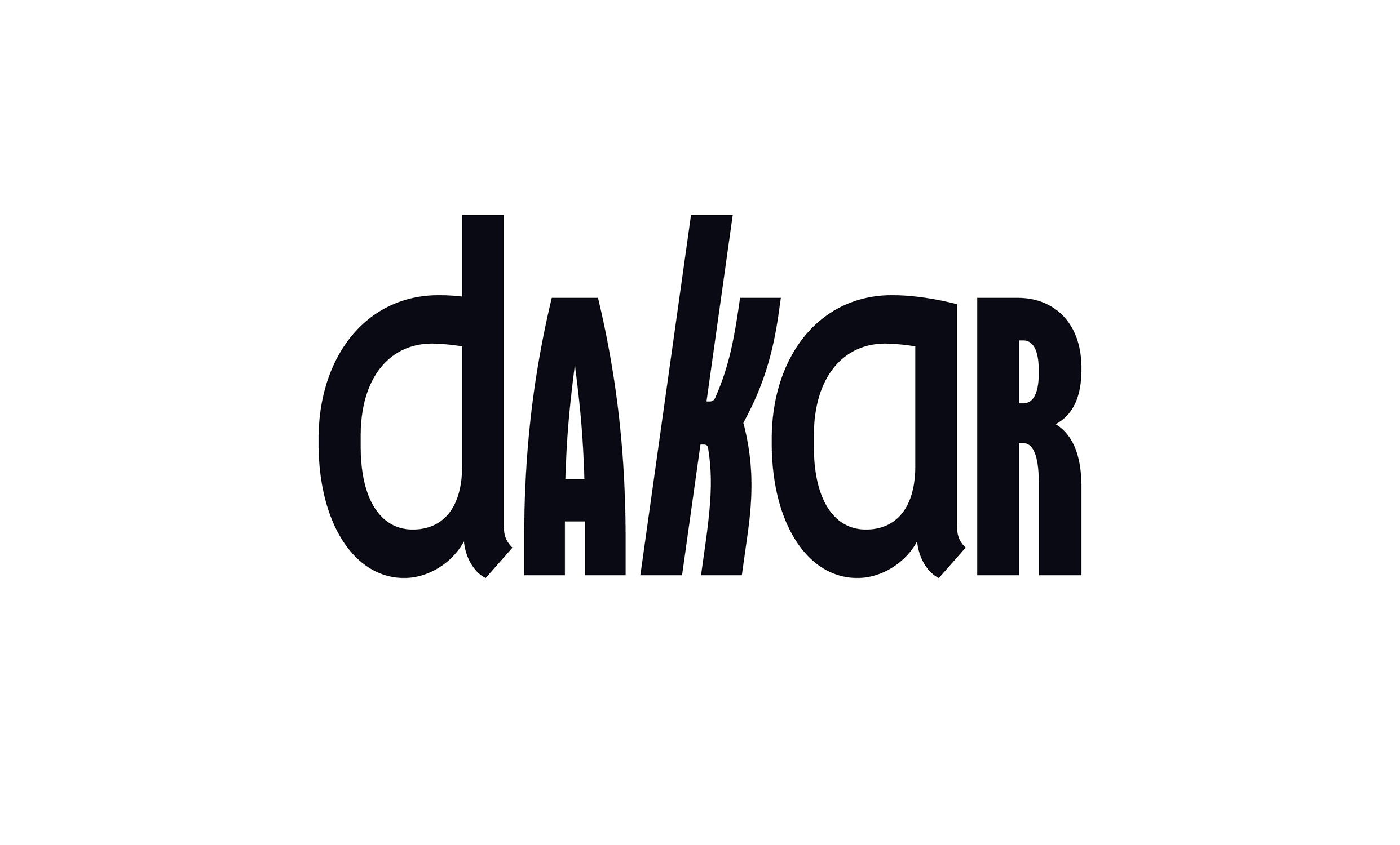
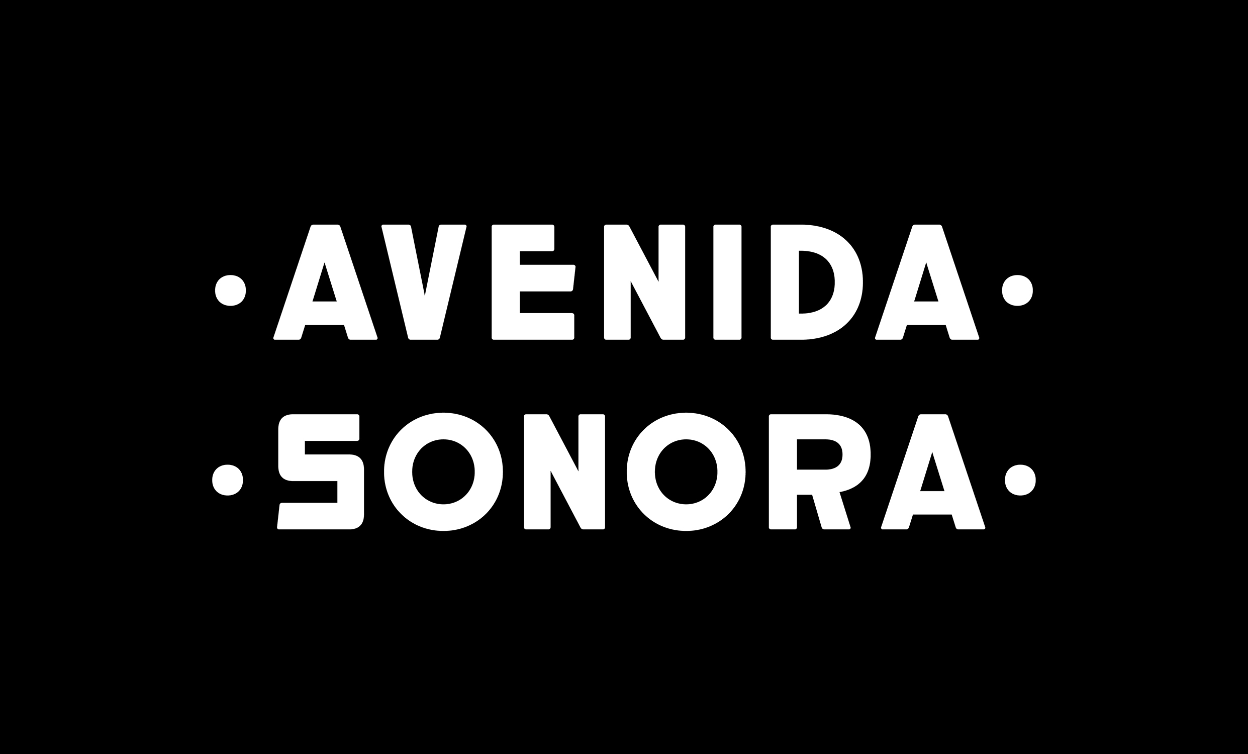
2. DF
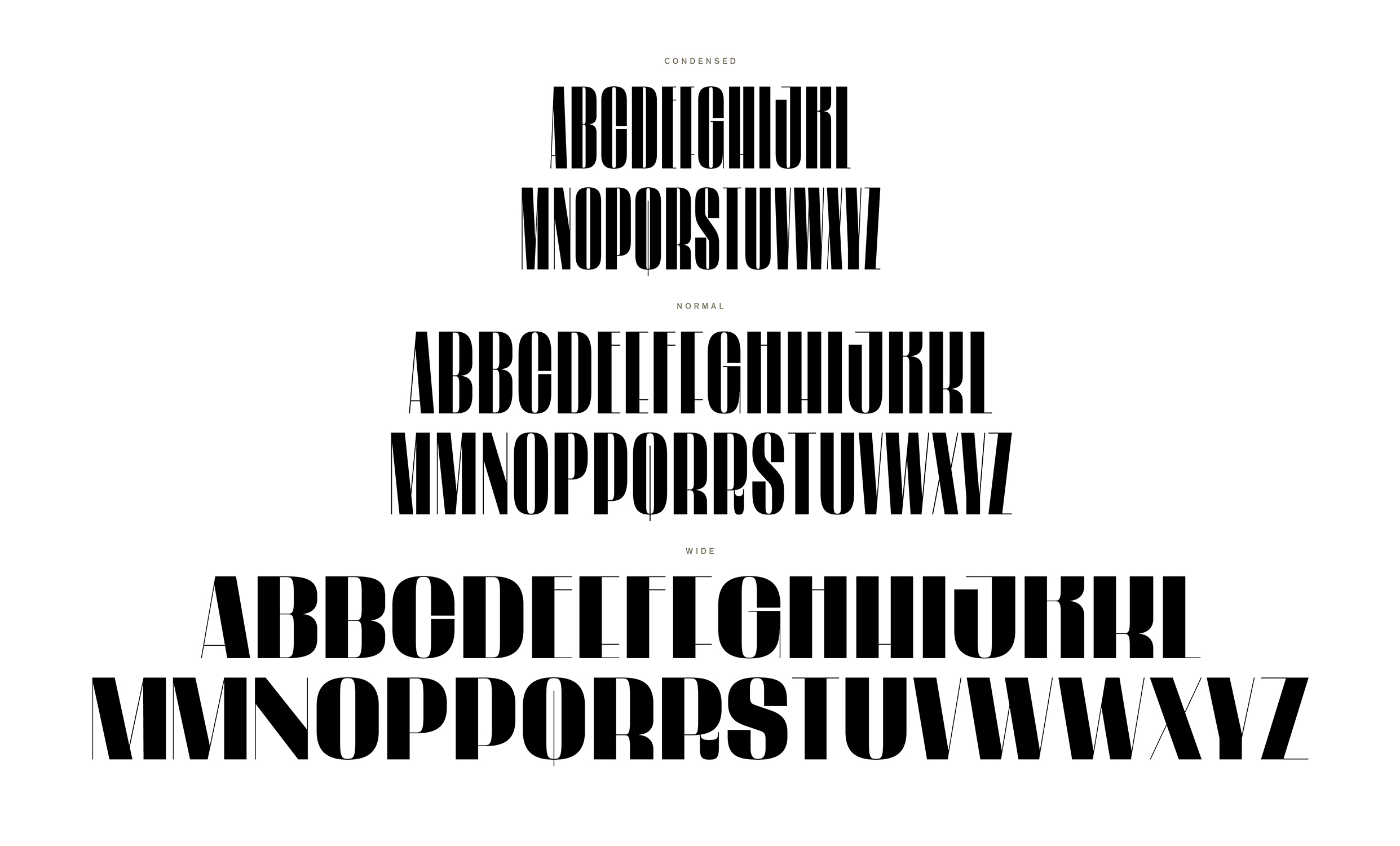
This set of characters was inspired by a sign (below) I’d seen in Parque México during my first visit to Mexico City in 2015. Having spent much time there throughout the last couple of years, I’ve since come to see and document many more of the signs surrounding the park that were created in the Art Deco style during the 1920’s and 30’s.With the few letters we had to reference, Tal was able to take the inpsiration and develop a full alphabet. I also asked him to create wide and condensed versions of each character to create some rythm and variety for it’s application in our Adventure Issue in April of 2016.


--
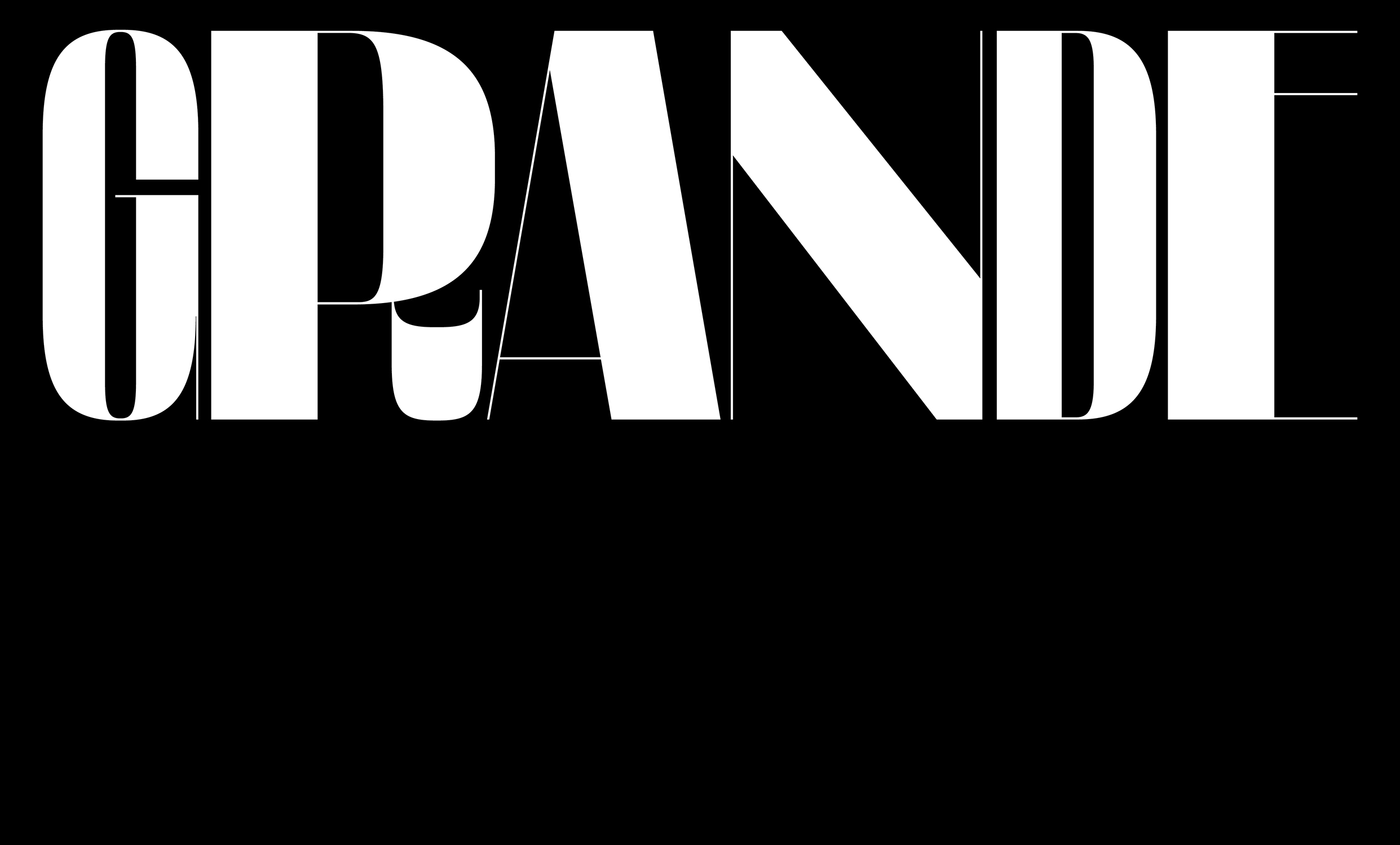
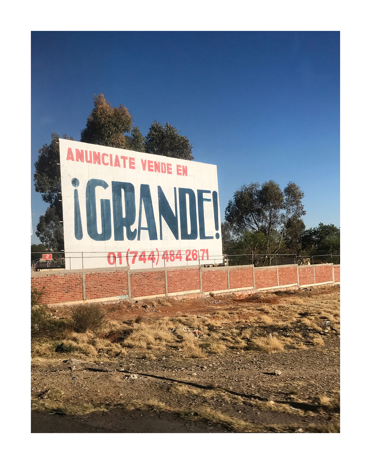
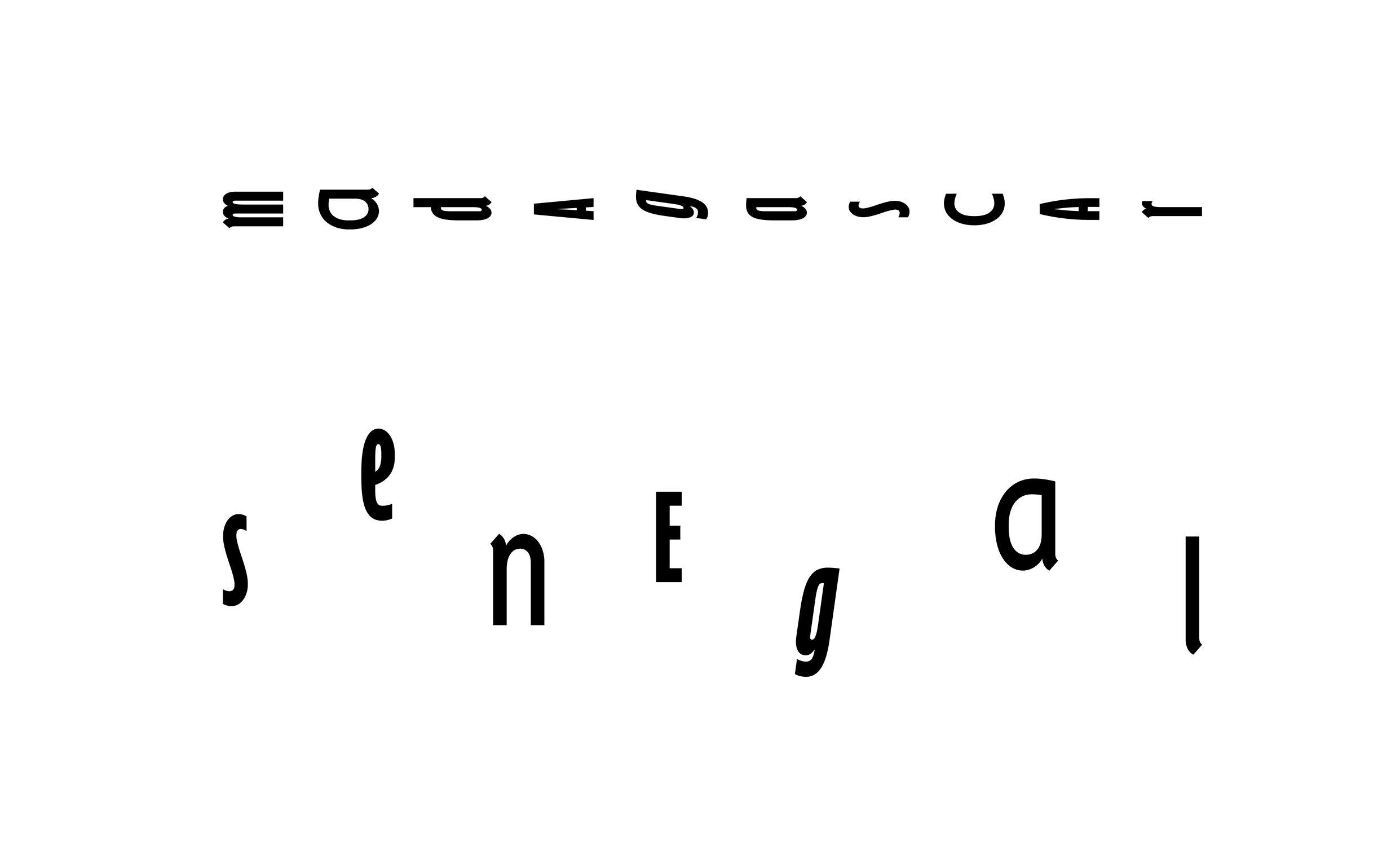
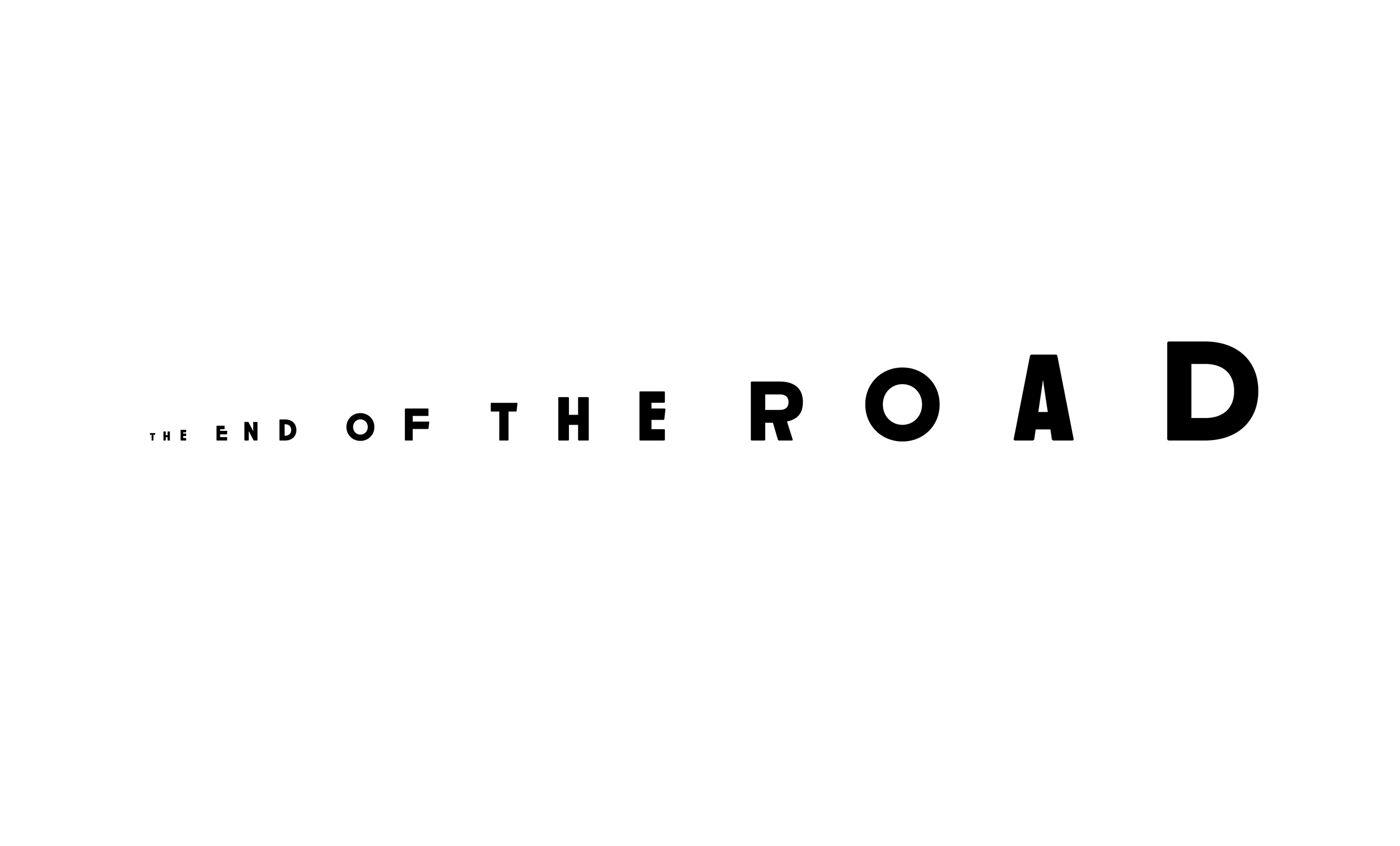
3. Elegante
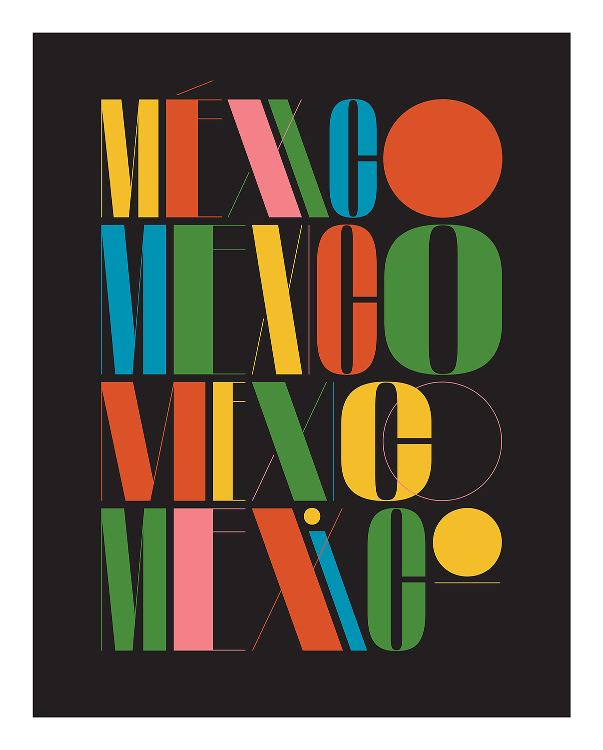
This set of characters was inspired by a sign I’d seen in Zacatecas, Mexico as we drove into town from the airport in 2017. Constanly amazed and inspired by the prominence of handdrawn signage in Mexico, my eyes are always on alert. This lettering in particular stuck with me. Initially, I wanted to create a much closer similarity to the clunky nature of the original but in the process of digitizing it, the charm completely evaporated and we both agreed it wasn’t working. For the purposes of Traveler and it’s aesthetic, we ultimately decided to push in the opposite direction and create a much more elegant version and thus the name was born. It was important for me to maintain the funky “R” in whatever capacity we could as well as to also create various widths, in-line with some of the typographic treatments that were becoming vernacular within the magazine. We utilized this for our Readers’ Choice Awards package in 2017 as we traditionally find wayts to brand it typographically each year. I also used it as the basis for a “México” inspired poster design earlier this year.